Getting Started
Check out the GitHub repository for information on how to use these patterns in your project, or view the Boilerplate for example markup.
Typography
ColorsDetails
Usage
Our main color palette.
<ul class="sg-colors">
  <li>
    <div class="sg-swatch" style="background: #2176d2;"></div>
    <div class="sg-label">
      #2176d2<br>
      rgb(37, 131, 231)<br>
      $ben-franklin-blue</div>
  </li>
  <li>
    <div class="sg-swatch" style="background: #96c9ff;"></div>
    <div class="sg-label">#96c9ff<br>
    rgb(150, 201, 255)<br>
    $ben-franklin-light</div>
  </li>
  <li>
    <div class="sg-swatch" style="background: #f3c613;"></div>
    <div class="sg-label">#f3c613<br>
    rgb(243, 198, 19)<br>
    $bell-yellow</div>
  </li>
  <li>
    <div class="sg-swatch" style="background: #f99300;"></div>
    <div class="sg-label">#f99300<br>
    rgb(249, 147, 0)<br>
    $flyers-orange</div>
  </li>
  <li>
    <div class="sg-swatch" style="background: #58c04d;"></div>
    <div class="sg-label">#58c04d<br>
    rgb(88, 192, 77)<br>
    $fairmount-green</div>
  </li>
  <li>
    <div class="sg-swatch" style="background: #ffffff;"></div>
    <div class="sg-label">#ffffff<br>
    rgb(255, 255, 255)<br>
    $white</div>
  </li>
  <li>
    <div class="sg-swatch" style="background: #f0f0f0;"></div>
    <div class="sg-label">#f0f0f0<br>
    rgb(240, 240, 240)<br>
    $ghost-gray</div>
  </li>
  <li>
    <div class="sg-swatch" style="background: #cfcfcf;"></div>
    <div class="sg-label">#cfcfcf<br>
    rgb(207, 207, 207)<br>
    $sidewalk</div>
  </li>
  <li>
    <div class="sg-swatch" style="background: #a1a1a1;"></div>
    <div class="sg-label">#a1a1a1<br>
    rgb(161, 161, 161)<br>
    $medium-gray</div>
  </li>
  <li>
    <div class="sg-swatch" style="background: #444444;"></div>
    <div class="sg-label">#444444<br>
    rgb(68, 68, 68)<br>
    $dark-gray</div>
  </li>
  <li>
    <div class="sg-swatch" style="background: #000000;"></div>
    <div class="sg-label">#000000<br>
    rgb(0, 0, 0)<br>
    $black</div>
  </li>
</ul>-
#2176d2
rgb(37, 131, 231)
$ben-franklin-blue -
#96c9ff
rgb(150, 201, 255)
$ben-franklin-light -
#f3c613
rgb(243, 198, 19)
$bell-yellow -
#f99300
rgb(249, 147, 0)
$flyers-orange -
#58c04d
rgb(88, 192, 77)
$fairmount-green -
#ffffff
rgb(255, 255, 255)
$white -
#f0f0f0
rgb(240, 240, 240)
$ghost-gray -
#cfcfcf
rgb(207, 207, 207)
$sidewalk -
#a1a1a1
rgb(161, 161, 161)
$medium-gray -
#444444
rgb(68, 68, 68)
$dark-gray -
#000000
rgb(0, 0, 0)
$black
FontsDetails
Usage
The main body font is Open Sans, imported from Google Web Fonts. The font for headings is Montserrat, also imported from Google Web Fonts.
<p>Primary font: "Open Sans", "Arial", sans-serif;</p>
<p><em>Primary font italic: "Open Sans", "Arial", sans-serif;</em></p>
<p><strong>Primary font bold: "Open Sans", "Arial", sans-serif;</strong></p>
<h1>Secondary font: 'Montserrat', 'Tahoma', sans-serif;</h1>
Primary font: "Open Sans", "Arial", sans-serif;
Primary font italic: "Open Sans", "Arial", sans-serif;
Primary font bold: "Open Sans", "Arial", sans-serif;
Secondary font: 'Montserrat', 'Tahoma', sans-serif;
ParagraphDetails
Usage
Standard paragraph tag.
<p>A paragraph (from the Greek paragraphos, "to write beside" or "written beside") is a self-contained unit of a discourse in writing dealing with a particular point or idea. A paragraph consists of one or more sentences. Though not required by the syntax of any language, paragraphs are usually an expected part of formal writing, used to organize longer prose.</p>A paragraph (from the Greek paragraphos, "to write beside" or "written beside") is a self-contained unit of a discourse in writing dealing with a particular point or idea. A paragraph consists of one or more sentences. Though not required by the syntax of any language, paragraphs are usually an expected part of formal writing, used to organize longer prose.
HeadingsDetails
Usage
You can add the 'contrast' class to any heading for a blue underline.
<h1>Heading 1</h1>
<h1 class="contrast">Heading 1</h1>

<h2>Heading 2</h2>
<h2 class="contrast">Heading 2 with contrast</h2>

<h3>Heading 3</h3>
<h3 class="contrast">Heading 3 with contrast</h3>

<h4>Heading 4</h4>
<h4 class="contrast">Heading 4 with contrast</h4>

<h5>Heading 5</h5>
<h5 class="contrast">Heading 5 with contrast</h5>

<h6>Heading 6</h6>
<h6 class="contrast">Heading 6 with contrast</h6>
Heading 1
Heading 1
Heading 2
Heading 2 with contrast
Heading 3
Heading 3 with contrast
Heading 4
Heading 4 with contrast
Heading 5
Heading 5 with contrast
Heading 6
Heading 6 with contrast
Heading - ClassesDetails
Usage
Class names can re-style headings. These should be used when the normal markup doesn't fit the flow of the page, but should be maintained.
<h6 class="h1">Heading 6 with h1 styles</h6>
<h1 class="h2">Heading 1 with h2 styles</h1>
<h2 class="h3">Heading 2 with h3 styles</h2>
<h3 class="h4">Heading 3 with h4 styles</h3>
<h4 class="h5">Heading 4 with h5 styles</h4>
<h5 class="h6">Heading 5 with h6 styles</h5>
Heading 6 with h1 styles
Heading 1 with h2 styles
Heading 2 with h3 styles
Heading 3 with h4 styles
Heading 4 with h5 styles
Heading 5 with h6 styles
Headings - AlternateDetails
Usage
You can use the alternate class for small, gray headings. All heading values render the same size. Use alternate divide for a yellow separator.
<h6 class="alternate">The City of Philadelphia</h6>
<h1 class="alternate divide">The City of Philadelphia</h1>
The City of Philadelphia
The City of Philadelphia
AddressDetails
Usage
Vcard markup for contact information
<div class="vcard">
  <div class="email"><span class="vcard-label">Email: </span><a href="mailto:email@email.com">email@email.com</a></div>
  <div class="org">Department Name</div>
  <div class="adr">
    <span class="street-address">1234 Main Street</span><br>
    <span class="locality">Philadelphia</span>,
    <abbr class="region" title="Pennsylvania">PA</abbr>,
    <span class="postal-code">19107</span>
  </div>
  <div class="tel"><span class="type vcard-label">Phone: </span><a href="tel:+18881234567">888-123-4567</a></div>
  <div class="fax"><span class="type vcard-label">Fax: </span>215-234-1234</div>
</div>Philadelphia, PA, 19107
BlockquoteDetails
Usage
A section of text that is quoted from another source.
<blockquote>
  The medium, or process, of our time - electric technology is reshaping and restructuring patterns of social interdependence and every aspect of our personal life. It is forcing us to reconsider and re-evaluate practically every thought, every action, and every institution formerly taken for granted.
<cite>The Medium is The Massage, Marshall McLuhan</cite>
</blockquote>
The medium, or process, of our time - electric technology is reshaping and restructuring patterns of social interdependence and every aspect of our personal life. It is forcing us to reconsider and re-evaluate practically every thought, every action, and every institution formerly taken for granted. The Medium is The Massage, Marshall McLuhan
CalloutDetails
Usage
Callouts should be used to draw attention to text that is important in the context of other paragraphs.
<div class="callout">
<p>You may need the following information before you pay online: Federal Entity Identification Number (EIN) or your Social Security Number (SSN) or Philadelphia Tax Account number and Philadelphia Department of Revenue PIN (personal identification number).</p>
</div>
You may need the following information before you pay online: Federal Entity Identification Number (EIN) or your Social Security Number (SSN) or Philadelphia Tax Account number and Philadelphia Department of Revenue PIN (personal identification number).
Horizontal RuleDetails
Usage
Help breakup a long page.
<hr>See All LinksDetails
Usage
Use the see-all-left or see-all-right classes to apply a left/right chevron to links. It is up to you to float them as needed.
<p><a class="see-all-right">See all right</a></p>
<p><a class="see-all-left">See all left</a></p>LinksDetails
Usage
Links are bold and $ben-franklin-blue. External links are indicated by using the exernal class.
<a href="http://phila.gov">Phila.gov</a><br>
<a href="http://alistapart.com/" class="external">A List Apart</a>Definition ListDetails
Usage
You can use rows and columns to position the definition and terms next to one another. Or not.
<dl class="row">
  <dt class="small-12 column">The word</dt>
  <dd class="small-12 column">The definition</dd>
</dl>- The word
- The definition
Inline ListDetails
Usage
List items can appear next to each other.
<ul class="inline-list">
  <li><a href="#/">Link 1</a></li>
  <li><a href="#/">Link 2</a></li>
  <li><a href="#/">Link 3</a></li>
  <li><a href="#/">Link 4</a></li>
  <li><a href="#/">Link 5</a></li>
</ul>Unordered List - No BulletsDetails
Usage
The no-bullet class will need to be added to any nested list items, if those lists should also be bullet-less.
<ul class="no-bullet">
  <li>List item with a much longer description or more content.</li>
  <li>List item</li>
  <li>List item
    <ul>
      <li>Nested List Item</li>
      <li>Nested List Item</li>
      <li>Nested List Item</li>
    </ul>
  </li>
  <li>List item</li>
  <li>List item</li>
  <li>List item</li>
</ul>- List item with a much longer description or more content.
- List item
- List item
- Nested List Item
- Nested List Item
- Nested List Item
- List item
- List item
- List item
Ordered ListDetails
Usage
List items with a specific order.
<ol>
  <li><a href="#/">Link 1</a></li>
  <li><a href="#/">Link 2</a></li>
  <li><a href="#/">Link 3</a></li>
  <li><a href="#/">Link 4</a></li>
  <li><a href="#/">Link 5</a></li>
</ol>Unordered ListDetails
Usage
Used when the order of the list items does not matter.
<ul>
  <li>List item with a much longer description or more content.</li>
  <li>List item</li>
  <li>List item
    <ul>
      <li>Nested List Item</li>
      <li>Nested List Item</li>
      <li>Nested List Item</li>
    </ul>
  </li>
  <li>List item</li>
  <li>List item</li>
  <li>List item</li>
</ul>- List item with a much longer description or more content.
- List item
- List item
- Nested List Item
- Nested List Item
- Nested List Item
- List item
- List item
- List item
Small TextDetails
Usage
Small, grayed out text.
<div class="small-text">Look how meta we are!</div>TimeDetails
Usage
Encode date/times in a machine-readable way.
<time datetime="2013-04-06T12:32+00:00">2 weeks ago</time>Grid
Full Width-LayoutDetails
Usage
See Foundation Docs for full list of options.
  <div class="row">
    <div class="small-24 column">1/1</div>
</div>Three Quarter LayoutDetails
Usage
See Foundation Docs for full list of options
<!--Grid 3/4up-->
<div class="row">
  <div class="medium-18 column">3/4</div>
  <div class="medium-6 column end">1/4</div>
</div>Three Column LayoutDetails
Usage
See Foundation Docs for full list of options
<div class="row">
  <div class="medium-8 column">1/3</div>
  <div class="medium-8 column">1/3</div>
  <div class="medium-8 column end">1/3</div>
</div>Two-Column LayoutDetails
Usage
See Foundation Docs for full list of options
<div class="row">
  <div class="medium-12 column">1/2</div>
  <div class="medium-12 column end">1/2</div>
</div>Containers
Content BlockDetails
Usage
Content blocks can be linked to more information, in which case the whole card is a link. To make a card, apply the 'card' class to an <a> tag that wraps the card content. The 'equal-height' class can be used to force blocks (and other elements) of different heights to appear equal.
<div class="row equal-height">
<div class="medium-8 columns">
<h2 class="h6 contrast">Card Block</h2>
<a href="http://www.phila.gov/experiencephila/mayor.html" class="card equal">
<img src="/patterns/images/visit-to-penrose.jpg" alt="Mayor Kenney Visits Penrose">
<div class="content-block">
<h3>Visit to Penrose Elementary School</h3>
<p>On Friday, January 15th, Mayor Kenney continued his weekly visits to Philadelphia public schools by stopping by Penrose Elementary School!</p>
</div>
</a>
</div>
<div class="medium-8 columns end">
<h2 class="h6 contrast">Unlinked Block</h2>
<div class="card equal">
<img src="/patterns/images/taxes.jpg" alt="">
<div class="content-block">
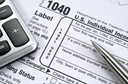
<h3>Changes in tax rates are now in effect</h3>
<p>As of July 1, 2015, Earnings, Wage & NPT - Resident (3.9102%) - Nonresident (3.4828%), U&O (1.21%), Parking & Valet Parking (22.5%), SIT (3.9102%), Real Estate .6317% (City) + .7681% (School) = 1.3998% (Total)</p>
</div>
</div>
</div>
</div>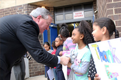
Unlinked Block
Changes in tax rates are now in effect
As of July 1, 2015, Earnings, Wage & NPT - Resident (3.9102%) - Nonresident (3.4828%), U&O (1.21%), Parking & Valet Parking (22.5%), SIT (3.9102%), Real Estate .6317% (City) + .7681% (School) = 1.3998% (Total)
Event BlockDetails
Usage
<div class="row">
  <div class="medium-8">
    <div class="event-box">
      <div class="event-row pam">
        <a href="#/" target="_blank">
          <div class="date-time">Monday, May  11 <br>
          12:00 PM - 2:00 PM</div>
        </a>
          <div class="event-title">Summer in Love Park 2015</div>
          <div class="event-location">JFK Plaza, 1599 John F. Kennedy Boulevard</div>
      </div>
       <div class="event-row pam">
         <a href="#/" target="_blank">
          <div class="date-time">Wednesday, May 13 <br>
          11:00 AM - 3:30 PM</div>
        </a>
          <div class="event-title">Veteran's Fair</div>
          <div class="event-location">Thomas Paine Plaza (MSB)</div>
      </div>
      <div class="event-row pam">
        <a href="#/" target="_blank">
          <div class="date-time">Friday, May 15 <br>
          7:00 AM - 6:00 PM</div>
        </a>
          <div class="event-title">Stotesbury Cup Regatta</div>
          <div class="event-location">Schuylkill River; Kelly Drive</div>
      </div>
    </div>
  </div>
</div>12:00 PM - 2:00 PM
ModalDetails
Usage
A modal
<a data-open="modal-name" class="button">Check out this great modal</a>
<div id="modal-name" class="reveal" data-reveal aria-labelledby="modal-title" aria-hidden="true" role="dialog">
<h1 id="modal-title">An h1</h1>
<p>A paragraph tag. You can basically put anything in here.</p>
<button class="close-button" data-close aria-label="Close modal" type="button">×</button>
</div>PanelDetails
Usage
<div class="panel center"><p>We're still working on this page's design and content. <a href="https://alpha.phila.gov/feedback/">How can we make it better?</a></p></div>We're still working on this page's design and content. How can we make it better?
TableDetails
Usage
Your standard table. You can add the no-borders class to any table to remove the inside and outside borders. Responsive tables are achieved using Stack Only Tablesaw and are built into Phila.gov Patterns. If your tables are loaded after the DOM, use $(document).trigger("enhance.tablesaw"); for responsive tables.
<table role="grid" class="tablesaw tablesaw-stack" data-tablesaw-mode="stack">
  <caption>If this table needs context other than paragraph information leading up to it, use this area. </caption>
  <thead>
    <tr>
      <th scope="col">Table Header</th>
      <th scope="col">Table Header</th>
      <th scope="col">Table Header</th>
      <th scope="col"><abbr title="Table">Tbl</abbr> Header</th>
    </tr>
  </thead>
  <tbody>
    <tr>
      <td>Content Goes Here</td>
      <td>This is longer content Donec id elit non mi porta gravida at eget metus.</td>
      <td>Content Goes Here</td>
      <td>Content Goes Here</td>
    </tr>
    <tr>
      <td>Content Goes Here</td>
      <td>This is longer Content Goes Here Donec id elit non mi porta gravida at eget metus.</td>
      <td>Content Goes Here</td>
      <td>Content Goes Here</td>
    </tr>
    <tr>
      <td>Content Goes Here</td>
      <td>This is longer Content Goes Here Donec id elit non mi porta gravida at eget metus.</td>
      <td>Content Goes Here</td>
      <td>Content Goes Here</td>
    </tr>
  </tbody>
</table>| Table Header | Table Header | Table Header | Tbl Header |
|---|---|---|---|
| Content Goes Here | This is longer content Donec id elit non mi porta gravida at eget metus. | Content Goes Here | Content Goes Here |
| Content Goes Here | This is longer Content Goes Here Donec id elit non mi porta gravida at eget metus. | Content Goes Here | Content Goes Here |
| Content Goes Here | This is longer Content Goes Here Donec id elit non mi porta gravida at eget metus. | Content Goes Here | Content Goes Here |
Table - VerticalDetails
Usage
A column focused table. You can add the no-borders class to any table to remove the inside and outside borders. Responsive tables are achieved using Stack Only Tablesaw and are built into Phila.gov Patterns. If your tables are loaded after the DOM, use $(document).trigger("enhance.tablesaw"); for responsive tables.
<table role="grid" class="tablesaw tablesaw-stack" data-tablesaw-mode="stack">
  <caption>If this table needs context other than paragraph information leading up to it, use this area. </caption>
  <tbody>
    <tr>
      <th>Content Goes Here</th>
      <td>This is longer content Donec id elit non mi porta gravida at eget metus.</td>
      <td><abbr title="Content">Cntnt</abbr> Goes Here</td>
      <td>Content Goes Here</td>
    </tr>
    <tr>
      <th>Content Goes Here</th>
      <td>This is longer Content Goes Here Donec id elit non mi porta gravida at eget metus.</td>
      <td>Content Goes Here</td>
      <td>Content Goes Here</td>
    </tr>
    <tr>
      <th>Content Goes Here</th>
      <td>This is longer Content Goes Here Donec id elit non mi porta gravida at eget metus.</td>
      <td>Content Goes Here</td>
      <td>Content Goes Here</td>
    </tr>
  </tbody>
</table>| Content Goes Here | This is longer content Donec id elit non mi porta gravida at eget metus. | Cntnt Goes Here | Content Goes Here |
|---|---|---|---|
| Content Goes Here | This is longer Content Goes Here Donec id elit non mi porta gravida at eget metus. | Content Goes Here | Content Goes Here |
| Content Goes Here | This is longer Content Goes Here Donec id elit non mi porta gravida at eget metus. | Content Goes Here | Content Goes Here |
TooltipsDetails
Usage
You can customize tooltips using foundation settings. Tooltups will automatically be initialized by using the has-tip class.
<p><span aria-haspopup="true" class="has-tip" title="You can't put markup in here, anymore.">Simple tooltip</span></p>Simple tooltip
Forms
Text FilterDetails
Usage
<div id="filter-list">
  <form>
    <input class="search" type="text" placeholder="Filter results...">
  </form>
  <ul class="list">
    <li>List item with a much longer description or more content.</li>
    <li>List item</li>
    <li>List item
      <ul>
        <li>Nested List Item</li>
        <li>Nested List Item</li>
        <li>Nested List Item</li>
      </ul>
    </li>
    <li>List item</li>
    <li>List item</li>
    <li>List item</li>
  </ul>

</div>- List item with a much longer description or more content.
- List item
- List item
- Nested List Item
- Nested List Item
- Nested List Item
- List item
- List item
- List item
CheckboxesDetails
Usage
<form action="#/">
  <fieldset class="options">
    <legend>Checkbox <abbr title="Required">*</abbr></legend>
    <ul class="no-bullet">
      <li><label for="checkbox1"><input id="checkbox1" name="checkbox" type="checkbox" checked="checked"> Choice A</label></li>
      <li><label for="checkbox2"><input id="checkbox2" name="checkbox" type="checkbox"> Choice B</label></li>
      <li><label for="checkbox3"><input id="checkbox3" name="checkbox" type="checkbox"> Choice C</label></li>
    </ul>
  </fieldset>
</form>Error Text FieldDetails
Usage
<p>
  <label class="error">Danger, Will Robinson!</label>
  <input class="is-error" type="text" placeholder="Text Input">
</p>
Valid InputDetails
Usage
<label  class="valid">Valid</label>
<input class="is-valid" type="text" placeholder="Text Input">Number InputDetails
Usage
<p>
  <label for="number">Number Input <abbr title="Required">*</abbr></label>
  <input id="number" type="number" placeholder="Enter a Number">
</p>
Password InputDetails
Usage
<p>
  <label for="password">Password</label>
  <input id="password" type="password" placeholder="Type your Password">
</p>
Text InputDetails
Usage
<p>
  <label for="text">Text Input <abbr title="Required">*</abbr></label>
  <input id="text" type="text" placeholder="Text Input">
</p>
TextareaDetails
Usage
<p>
  <label for="textarea">Textarea</label>
  <textarea id="textarea" rows="8" cols="48" placeholder="Enter your message here"></textarea>
</p>
Web AddressDetails
Usage
<p>
  <label for="webaddress">Web Address</label>
  <input id="webaddress" type="url" placeholder="http://yoursite.com">
</p>
Search FormDetails
Usage
Use the data-global-search attribute on the form element and the search-field class on the input to send searches to alpha.phila.gov. To use your own search functionality, omit the data attribute.
<form class="search" data-global-search>
  <input type="text" placeholder="Search alpha.phila.gov" class="search-field"><input type="submit">
</form>Navigation
Global
Page TitleDetails
Usage
The title tag should be in the following format - Page Title | phila.gov
<title>Phila.gov Patterns | phila.gov</title>Default Header Sans SearchDetails
Usage
<!-- Begin .header -->
<header data-swiftype-index='false' class="site-header">
<div class="row site-branding">
<div class="small-24 medium-12 columns">
<a href="https://alpha.phila.gov" class="logo">
<img src="//cityofphiladelphia.github.io/patterns/images/city-of-philadelphia-white.png" alt="City of Philadelphia">
</a>
<h1 class="site-title">phila.gov</h1>
<h2 class="site-description">City of Philadelphia</h2>
</div>
</div>
<div class="row expanded">
  <div class="columns">
    <div class="row">
      <div class="large-24 columns">
        <nav>
          <ul class="breadcrumbs">
            <li><a href="#/">Home</a></li>
            <li><a href="#/">Grandparent</a></li>
            <li><a href="#/">Parent</a></li>
            <li>Child</li>
          </ul>
        </nav>
      </div>
    </div>
  </div>
</div>
</header>
phila.gov
City of Philadelphia
Default HeaderDetails
Usage
<!-- Begin .header -->
<header data-swiftype-index='false' class="site-header">
<div class="row site-branding">
<div class="small-24 medium-12 columns">
<a href="https://alpha.phila.gov" class="logo pam">
<img src="//cityofphiladelphia.github.io/patterns/images/city-of-philadelphia-white.png" alt="City of Philadelphia">
</a>
<h1 class="site-title">phila.gov</h1>
<h2 class="site-description">City of Philadelphia</h2>
</div>
<div class="small-24 medium-12 columns">
<form class="search" data-global-search>
<input type="text" placeholder="Search alpha.phila.gov" class="search-field"><input type="submit">
</form>
</div>
</div>
<div class="row expanded">
<div class="columns">
<div class="row">
<div class="large-24 columns">
<nav>
<ul class="breadcrumbs">
<li><a href="#/">Home</a></li>
<li><a href="#/">Grandparent</a></li>
<li><a href="#/">Parent</a></li>
<li>Child</li>
</ul>
</nav>
</div>
</div>
</div>
</div>
</header>phila.gov
City of Philadelphia
Application HeaderDetails
Usage
Application Header, with app name next to logo. Please note the class "app" on the header tag. See application page for an example of a full-width layout.
<!-- Begin header -->
<header data-swiftype-index='false' class="site-header app">
<div class="row">
<div class="small-24 columns">
<a href="http://alpha.phila.gov/" class="logo">
<img data-interchange="[//cityofphiladelphia.github.io/patterns/images/city-of-philadelphia-mobile.png, small], [//cityofphiladelphia.github.io/patterns/images/city-of-philadelphia-white.png, medium]" src="//cityofphiladelphia.github.io/patterns/images/city-of-philadelphia-white.png" alt="City of Philadelphia">
</a>
<div class="page-title-container">
<a href="#/">
<h1 class="page-title">Application Name With a Long Title</h1>
<h2 class="page-subtitle">An optional subtitle</h2>
</a>
</div>
</div>
</div>
<div class="row expanded">
<div class="small-24 small-centered columns">
<div class="title-bar" data-responsive-toggle="site-nav" data-hide-for="medium">
  <button class="menu-icon" type="button" data-toggle><span class="title-bar-title">Menu</span></button>
</div>
<div class="top-bar" id="site-nav">
  <nav>
    <ul class="dropdown vertical medium-horizontal menu" data-responsive-menu="drilldown medium-dropdown">
      <li>
        <a href="#">Item 1</a>
        <ul class="submenu menu vertical">
          <li><a href="#">Item 1A</a></li>
          <li><a href="#">Item 1B</a></li>
          <li><a href="#">Item 1C</a>
            <ul class="submenu menu vertical">
              <li><a href="#">Item 2C</a></li>
              <li><a href="#">Item 2C</a></li>
              <li><a href="#">Item 2C</a></li>
            </ul>
          </li>
        </ul>
      </li>
      <li class="current"><a href="#">Item 2</a></li>
      <li><a href="#">Item 3</a></li>
      <li><a href="#">Item 4</a></li>
    </ul>
  </nav>
</div>
</div>
</div>
</header>Header with Site-Wide AlertDetails
Usage
<!-- Begin .header -->
<header data-swiftype-index='false' class="site-header">
  <div class="row site-branding">
    <div class="small-24 medium-12 columns">
      <a href="https://alpha.phila.gov" class="logo pam">
        <img src="//cityofphiladelphia.github.io/patterns/images/city-of-philadelphia-white.png" alt="City of Philadelphia">
      </a>
      <h1 class="site-title">phila.gov</h1>
      <h2 class="site-description">City of Philadelphia</h2>
    </div>
    <div class="small-24 medium-12 columns">
      <form class="search" data-global-search>
  <input type="text" placeholder="Search alpha.phila.gov" class="search-field"><input type="submit">
</form>

    </div>
  </div>
  <div class="row expanded">
  <div class="columns">
    <div class="row">
      <div class="large-24 columns">
        <nav>
          <ul class="breadcrumbs">
            <li><a href="#/">Home</a></li>
            <li><a href="#/">Grandparent</a></li>
            <li><a href="#/">Parent</a></li>
            <li>Child</li>
          </ul>
        </nav>
      </div>
    </div>
  </div>
</div>

</header>
<div id="site-wide-alert">
<div class="row">
<div class="large-8 columns">
<h2><i class="ionicons ion-alert-circled"></i>Winter Weather Advisory</h2>
<div class="alert-start"><time datetime="2015-01-05">01-05-2015 06:00pm</time> <strong>to</strong> <time datetime="2015-01-08">01-08-2015 02:00</time>pm</div>
</div>
<div class="large-16 columns">
<strong>Code Blue Effective: </strong>Severe cold weather is expected. If you see a homeless person on the street, please call the Project Home Outreach Hotline 215 232 1884. For all other winter-related inquiries, call 311.
</div>
</div>
</div>phila.gov
City of Philadelphia
Winter Weather Advisory
Alpha-Beta alertDetails
Usage
A banner telling users a site is in alpha or beta and what that means.
<div id="alpha-alert">
  <div class="row">
    <div class="large-16 columns">
      <p>We're piloting a new, user-friendly website design. To view the existing City website, visit <a class="external" href="http://www.phila.gov" target="_blank">phila.gov<span class="accessible"> Opens in new window</span></a>.
    </div>
    <div class="large-8 columns accessibility">
      <i class="fa fa-globe"></i><div id="google_translate_element"></div>
        <script type="text/javascript">
          function googleTranslateElementInit() {
            new google.translate.TranslateElement({pageLanguage: 'en', layout: google.translate.TranslateElement.InlineLayout.SIMPLE}, 'google_translate_element');
          }
        </script>
        <script type="text/javascript" src="//translate.google.com/translate_a/element.js?cb=googleTranslateElementInit"></script>
    </div>
  </div>
</div>
We're piloting a new, user-friendly website design. To view the existing City website, visit phila.gov Opens in new window.
Site-Wide AlertDetails
Usage
Usually a weather-related alert
<div id="site-wide-alert">
  <div class="row">
    <div class="large-8 columns">
      <h2><i class="ionicons ion-alert-circled"></i>Winter Weather Advisory</h2>
        <div class="alert-start"><time datetime="2015-01-05">01-05-2015 06:00pm</time> <strong>to</strong> <time datetime="2015-01-08">01-08-2015 02:00</time>pm</div>
      </div>
        <div class="large-16 columns">
          <strong>Code Blue Effective: </strong>Severe cold weather is expected. If you see a homeless person on the street, please call the Project Home Outreach Hotline 215 232 1884. For all other winter-related inquiries, call 311.
        </div>
    </div>
</div>
Winter Weather Advisory
Helper Classes
AccessibilityDetails
Usage
An off-viewport notice for links that open in a new window.
<span class="accessible"> Opens in new window</span>Border BottomDetails
Usage
Adding border-bottom-list to a ul will provide padding and a border under each list time, except for the last one. Using the border-bottom class will apply a bottom border to any element.
<div class="border-bottom mbm">
  This div has a bottom border.
</div>

In the following list, every item except for the last has a bottom border:

<ul class="border-bottom-list no-bullet">
  <li><a href="http://www.phila.gov/property/Pages/default.aspx">Department of Public Property</a></li>
  <li><a href="http://www.phila.gov/records//index.html">Department of Records</a></li>
  <li><a href="http://mbec.phila.gov/procurement/proc.asp">Procurement Department</a></li>
  <li><a href="http://www.phila.gov/fleet//index.html">Office of Fleet Management</a></li>
  <li><a href="http://www.phila.gov/it/Pages/default.aspx">Office of Innovation and Technology</a></li>
</ul>Color ClassesDetails
Usage
Add a class of any named color to an element to modify that element's color value. You can do the sme thing, with background colors.
<div class="ben-franklin-blue">Ben Franklin Blue</div>
<div class="bell-yellow">Bell Yellow</div>
<div class="flyers-orange">Flyers Orange</div>
<div class="fairmount-green">Fairmount Green</div>
<div class="ben-franklin-light">Ben Franklin Light</div>
<div class="black">Black</div>
<div class="white">White</div>
<div class="dark-gray">Dark Gray</div>
<div class="medium-gray">Medium Gray</div>
<div class="sidewalk">Sidewalk</div>

<div class="bg-ben-franklin-blue">Ben Franklin Blue</div>
<div class="bg-bell-yellow">Bell Yellow</div>
<div class="bg-flyers-orange">Flyers Orange</div>
<div class="bg-fairmount-green">Fairmount Green</div>
<div class="bg-ben-franklin-light">Ben Franklin Light</div>
<div class="bg-black">Black</div>
<div class="bg-white">White</div>
<div class="bg-dark-gray">Dark Gray</div>
<div class="bg-medium-gray">Medium Gray</div>
<div class="bg-sidewalk">Sidewalk</div>Equal Height DivsDetails
Usage
Use the equal-height class on a parent element and the equal class on elements within that can have variable height.
<div class="row equal-height">
  <div class="medium-8 columns">
    <h2 class="h6 contrast">Card Block</h2>
    <a href="http://www.phila.gov/experiencephila/mayor.html" class="card equal">
      <img src="/patterns/images/visit-to-penrose.jpg" alt="Mayor Kenney Visits Penrose">
        <div class="content-block">
          <h3>Visit to Penrose Elementary School</h3>
          <p>On Friday, January 15th, Mayor Kenney continued his weekly visits to Philadelphia public schools by stopping by Penrose Elementary School!</p>
        </div>
      </a>
  </div>
  <div class="medium-8 columns">
    <h2 class="h6 contrast">Unlinked Block</h2>
    <div class="card equal">
      <img src="/patterns/images/taxes.jpg" alt="">
      <div class="content-block">
        <h3>Changes in tax rates are now in effect</h3>
        <p>As of July 1, 2015, Earnings, Wage & NPT - Resident (3.9102%) - Nonresident (3.4828%), U&O (1.21%), Parking & Valet Parking (22.5%), SIT (3.9102%), Real Estate .6317% (City) + .7681% (School) = 1.3998% (Total)</p>
      </div>
    </div>
  </div>
  <div class="medium-8 columns">
    <h2 class="h6 contrast">Example div</h2>
    <div class="card equal">
      <div class="content-block">
        <h3>Example div</h3>
        <p>Bacon ipsum dolor amet meatloaf turducken pork chop, prosciutto cupidatat incididunt aliqua ball tip shankle laboris ad dolor eiusmod. Nulla in corned beef meatloaf aute, boudin mollit nostrud cillum. Excepteur brisket short loin, id ribeye turducken laboris cupidatat officia doner laborum ut.</p>
        <p>Bacon ipsum dolor amet meatloaf turducken pork chop, prosciutto cupidatat incididunt aliqua ball tip shankle laboris ad dolor eiusmod. Nulla in corned beef meatloaf aute, boudin mollit nostrud cillum. Excepteur brisket short loin, id ribeye turducken laboris cupidatat officia doner laborum ut.</p>
      </div>
    </div>
  </div>
</div>Unlinked Block
Changes in tax rates are now in effect
As of July 1, 2015, Earnings, Wage & NPT - Resident (3.9102%) - Nonresident (3.4828%), U&O (1.21%), Parking & Valet Parking (22.5%), SIT (3.9102%), Real Estate .6317% (City) + .7681% (School) = 1.3998% (Total)
Example div
Example div
Bacon ipsum dolor amet meatloaf turducken pork chop, prosciutto cupidatat incididunt aliqua ball tip shankle laboris ad dolor eiusmod. Nulla in corned beef meatloaf aute, boudin mollit nostrud cillum. Excepteur brisket short loin, id ribeye turducken laboris cupidatat officia doner laborum ut.
Bacon ipsum dolor amet meatloaf turducken pork chop, prosciutto cupidatat incididunt aliqua ball tip shankle laboris ad dolor eiusmod. Nulla in corned beef meatloaf aute, boudin mollit nostrud cillum. Excepteur brisket short loin, id ribeye turducken laboris cupidatat officia doner laborum ut.
LoadingDetails
Usage
Animate a "Loading" placeholder by adding the spin class to Font Awesome's fa-spinner icon.
<div><i class="fa fa-spinner fa-lg spin"></i> Loading...</div>SpacingDetails
Usage
Most of this comes from Tachyons.io with one major difference. Instead of using the -ns suffix for "not small" classnames, use -mu for "medium up". Spacing values documented below.
<div class="spacing-examples">
  <section class="panel">
    <h4>Key</h4>
    p = padding<br>
    m = margin<br>
    a = all<br>
    h = horizontal<br>
    v = vertical<br>
    t = top<br>
    r = right<br>
    b = bottom<br>
    l = left<br>
    n = none = 0rem<br>
    xs = extra small = .25rem<br>
    s = small = .5rem<br>
    m = medium = 1rem<br>
    l = large = 2rem<br>
    x = extra = 4rem<br>
    xl = extra large = 6rem<br>
    xxx = extra extra large = 8rem
  </section>
  <h3 class="ptl">Padding All</h3>
    <p>paxs, pas, pam, pal, paxl, paxxl, paxxxl</p>
    <div><div class="pan mbs">pan</div></div>
    <div><div class="paxs mbs">paxs</div></div>
    <div><div class="pas mbs">pas</div></div>
    <div><div class="pam mbs">pam</div></div>
    <div><div class="pal mbs">pal</div></div>
    <div><div class="paxl mbs">paxl</div></div>
    <div><div class="paxxl mbs">paxxl</div></div>
    <div><div class="paxxxl mbs">paxxxl</div></div>
    <h3 class="ptl">Padding Horizontal</h3>
    <div><div class="phn mbs">phn</div></div>
    <div><div class="phxs mbs">phxs </div></div>
    <div><div class="phs mbs"> phs</div></div>
    <div><div class="phm mbs"> phm</div></div>
    <div><div class="phl mbs"> phl</div></div>
    <div><div class="phxl mbs"> phxl</div></div>
    <div><div class="phxxl mbs"> phxxl</div></div>
    <div><div class="phxxxl mbs"> phxxxl</div></div>
    <h3 class="ptl">Padding Vertical</h3>
    <div><div class="pvn mbs">pvn</div></div>
    <div><div class="pvxs mbs">pvxs </div></div>
    <div><div class="pvs mbs"> pvs</div></div>
    <div><div class="pvm mbs"> pvm</div></div>
    <div><div class="pvl mbs"> pvl</div></div>
    <div><div class="pvxl mbs"> pvxl</div></div>
    <div><div class="pvxxl mbs"> pvxxl</div></div>
    <div><div class="pvxxxl mbs"> pvxxxl</div></div>
    <h3 class="ptl">Padding Left</h3>
    <div><div class="pln mbs">pln</div></div>
    <div><div class="plxs mbs">plxs </div></div>
    <div><div class="pls mbs"> pls</div></div>
    <div><div class="plm mbs"> plm</div></div>
    <div><div class="pll mbs"> pll</div></div>
    <div><div class="plxl mbs"> plxl</div></div>
    <div><div class="plxxl mbs"> plxxl</div></div>
    <div><div class="plxxxl mbs"> plxxxl</div></div>
    <h3 class="ptl">Padding Right</h3>
    <div><div class="prn mbs">prn</div></div>
    <div><div class="prxs mbs">prxs </div></div>
    <div><div class="prs mbs"> prs</div></div>
    <div><div class="prm mbs"> prm</div></div>
    <div><div class="prl mbs"> prl</div></div>
    <div><div class="prxl mbs"> prxl</div></div>
    <div><div class="prxxl mbs"> prxxl</div></div>
    <div><div class="prxxxl mbs"> prxxxl</div></div>
    <h3 class="ptl">Padding Top</h3>
    <div><div class="ptn mbs">ptn</div></div>
    <div><div class="ptxs mbs">ptxs </div></div>
    <div><div class="pts mbs"> pts</div></div>
    <div><div class="ptm mbs"> ptm</div></div>
    <div><div class="ptl mbs"> ptl</div></div>
    <div><div class="ptxl mbs"> ptxl</div></div>
    <div><div class="ptxxl mbs"> ptxxl</div></div>
    <div><div class="ptxxxl mbs"> ptxxxl</div></div>
    <h3 class="ptl">Padding Bottom</h3>
    <div><div class="ptn mbs">ptn</div></div>
    <div><div class="pbxs mbs">pbxs </div></div>
    <div><div class="pbs mbs"> pbs</div></div>
    <div><div class="pbm mbs"> pbm</div></div>
    <div><div class="pbl mbs"> pbl</div></div>
    <div><div class="pbxl mbs"> pbxl</div></div>
    <div><div class="pbxxl mbs"> pbxxl</div></div>
    <div><div class="pbxxxl mbs"> pbxxxl</div></div>

    <h3 class="ptl">Margin All</h3>
    <p>maxs, mas, mam, mal, maxl, maxxl, maxxxl</p>
    <div class="bg-black-10"><div class="man">man</div></div>
    <div class="bg-black-20"><div class="maxs">maxs</div></div>
    <div class="bg-black-30"><div class="mas">mas</div></div>
    <div class="bg-black-40"><div class="mam">mam</div></div>
    <div class="bg-black-50"><div class="mal">mal</div></div>
    <div class="bg-black-60"><div class="maxl">maxl</div></div>
    <div class="bg-black-70"><div class="maxxl">maxxl</div></div>
    <div class="bg-black-80"><div class="maxxxl">maxxxl</div></div>
    <h3 class="ptl">Margin Horizontal</h3>
    <div class="bg-black-10"><div class="mhn">mhn</div></div>
    <div class="bg-black-20"><div class="mhxs">mhxs </div></div>
    <div class="bg-black-30"><div class="mhs"> mhs</div></div>
    <div class="bg-black-40"><div class="mhm"> mhm</div></div>
    <div class="bg-black-50"><div class="mhl"> mhl</div></div>
    <div class="bg-black-60"><div class="mhxl"> mhxl</div></div>
    <div class="bg-black-70"><div class="mhxxl"> mhxxl</div></div>
    <div class="bg-black-80"><div class="mhxxxl"> mhxxxl</div></div>
    <h3 class="ptl">Margin Vertical</h3>
    <div class="bg-black-10"><div class="mvn">mvn</div></div>
    <div class="bg-black-20"><div class="mvxs">mvxs </div></div>
    <div class="bg-black-30"><div class="mvs"> mvs</div></div>
    <div class="bg-black-40"><div class="mvm"> mvm</div></div>
    <div class="bg-black-50"><div class="mvl"> mvl</div></div>
    <div class="bg-black-60"><div class="mvxl"> mvxl</div></div>
    <div class="bg-black-70"><div class="mvxxl"> mvxxl</div></div>
    <div class="bg-black-80"><div class="mvxxxl"> mvxxxl</div></div>
    <h3 class="ptl">Margin Left</h3>
    <div class="bg-black-10"><div class="mln">mln</div></div>
    <div class="bg-black-20"><div class="mlxs">mlxs </div></div>
    <div class="bg-black-30"><div class="mls"> mls</div></div>
    <div class="bg-black-40"><div class="mlm"> mlm</div></div>
    <div class="bg-black-50"><div class="mll"> mll</div></div>
    <div class="bg-black-60"><div class="mlxl"> mlxl</div></div>
    <div class="bg-black-70"><div class="mlxxl"> mlxxl</div></div>
    <div class="bg-black-80"><div class="mlxxxl"> mlxxxl</div></div>
    <h3 class="ptl">Margin Right</h3>
    <div class="bg-black-10"><div class="mrn">mrn</div><div class="pas bg-black"></div></div>
    <div class="bg-black-20"><div class="mrxs">mrxs </div><div class="pas bg-black"></div></div>
    <div class="bg-black-30"><div class="mrs"> mrs</div><div class="pas bg-black"></div></div>
    <div class="bg-black-40"><div class="mrm"> mrm</div><div class="pas bg-black"></div></div>
    <div class="bg-black-50"><div class="mrl"> mrl</div><div class="pas bg-black"></div></div>
    <div class="bg-black-60"><div class="mrxl"> mrxl</div><div class="pas bg-black"></div></div>
    <div class="bg-black-70"><div class="mrxxl"> mrxxl</div><div class="pas bg-black"></div></div>
    <div class="bg-black-80"><div class="mrxxxl"> mrxxxl</div><div class="pas bg-black"></div></div>
    <h3 class="ptl">Margin Top</h3>
    <div class="bg-black-10"><div class="mtn">mtn</div></div>
    <div class="bg-black-20"><div class="mtxs">mtxs </div></div>
    <div class="bg-black-30"><div class="mts"> mts</div></div>
    <div class="bg-black-40"><div class="mtm"> mtm</div></div>
    <div class="bg-black-50"><div class="mtl"> mtl</div></div>
    <div class="bg-black-60"><div class="mtxl"> mtxl</div></div>
    <div class="bg-black-70"><div class="mtxxl"> mtxxl</div></div>
    <div class="bg-black-80"><div class="mtxxxl"> mtxxxl</div></div>
    <h3 class="ptl">Margin Bottom</h3>
    <div class="bg-black-10"><div class="mbn">mbn</div></div>
    <div class="bg-black-20"><div class="mbxs">mbxs </div></div>
    <div class="bg-black-30"><div class="mbs"> mbs</div></div>
    <div class="bg-black-40"><div class="mbm"> mbm</div></div>
    <div class="bg-black-50"><div class="mbl"> mbl</div></div>
    <div class="bg-black-60"><div class="mbxl"> mbxl</div></div>
    <div class="bg-black-70"><div class="mbxxl"> mbxxl</div></div>
    <div class="bg-black-80"><div class="mbxxxl"> mbxxxl</div></div>

</div>
Key
p = paddingm = margin
a = all
h = horizontal
v = vertical
t = top
r = right
b = bottom
l = left
n = none = 0rem
xs = extra small = .25rem
s = small = .5rem
m = medium = 1rem
l = large = 2rem
x = extra = 4rem
xl = extra large = 6rem
xxx = extra extra large = 8rem
Padding All
paxs, pas, pam, pal, paxl, paxxl, paxxxl
Padding Horizontal
Padding Vertical
Padding Left
Padding Right
Padding Top
Padding Bottom
Margin All
maxs, mas, mam, mal, maxl, maxxl, maxxxl
Margin Horizontal
Margin Vertical
Margin Left
Margin Right
Margin Top
Margin Bottom
Vertical AlignDetails
Usage
Add .valign to a wrapping div and .valign-cell to the target div to create responsive vertically aligned content.
<div class="row equal-height">
  <div class="small-24 medium-16 intro-item columns equal">
    <div>
      <p>Rem dolorum dolor sapiente expedita. Neque quasi dolorum ut sed quis illo sit aspernatur. Architecto natus facere odit rem omnis labore dolores distinctio. Similique ipsam aut quaerat quaerat. Nulla quae optio perspiciatis debitis numquam et officiis.</p>
    </div>
  </div>
  <div class="small-24 medium-8 columns center equal">
      <div class="valign mvm mvn-mu">
          <div class="valign-cell">
              <span>Verically aligned content</span>
          </div>
      </div>
  </div>
</div>
Rem dolorum dolor sapiente expedita. Neque quasi dolorum ut sed quis illo sit aspernatur. Architecto natus facere odit rem omnis labore dolores distinctio. Similique ipsam aut quaerat quaerat. Nulla quae optio perspiciatis debitis numquam et officiis.
White-spaceDetails
Usage
Add classes to modify an element's white-space value.
<span class="nowrap"> Sets <code>white-space</code> property to <code>nowrap</code></span>white-space property to nowrap